Classic Benjamin Moore Paint Colors
My Go-To Paint Colors For Our Home
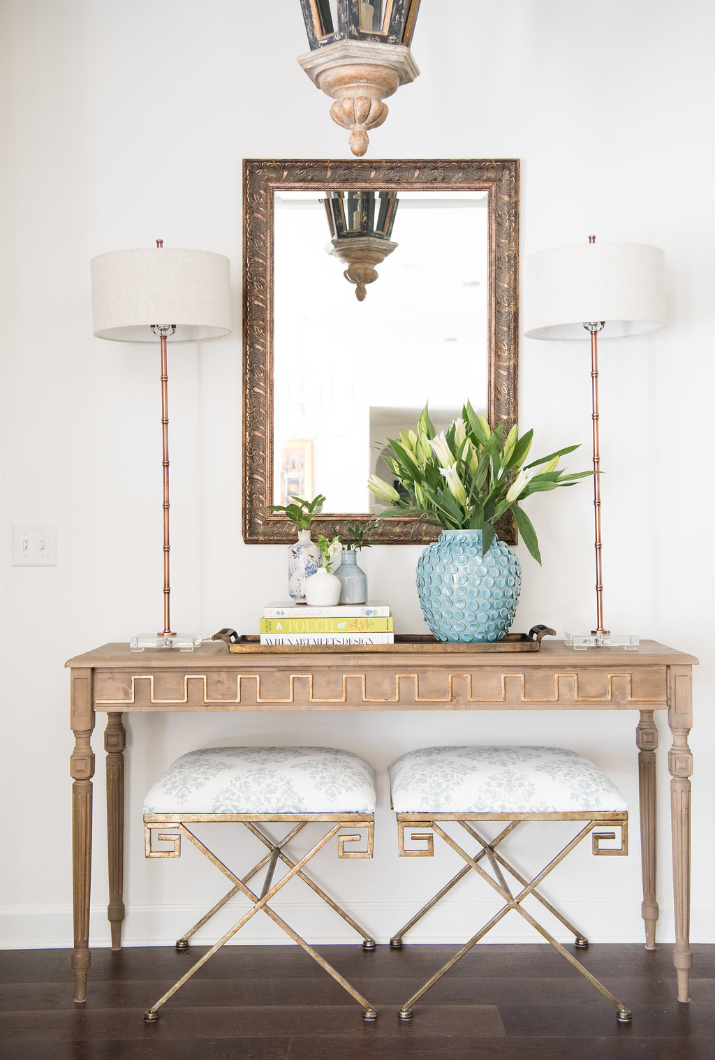
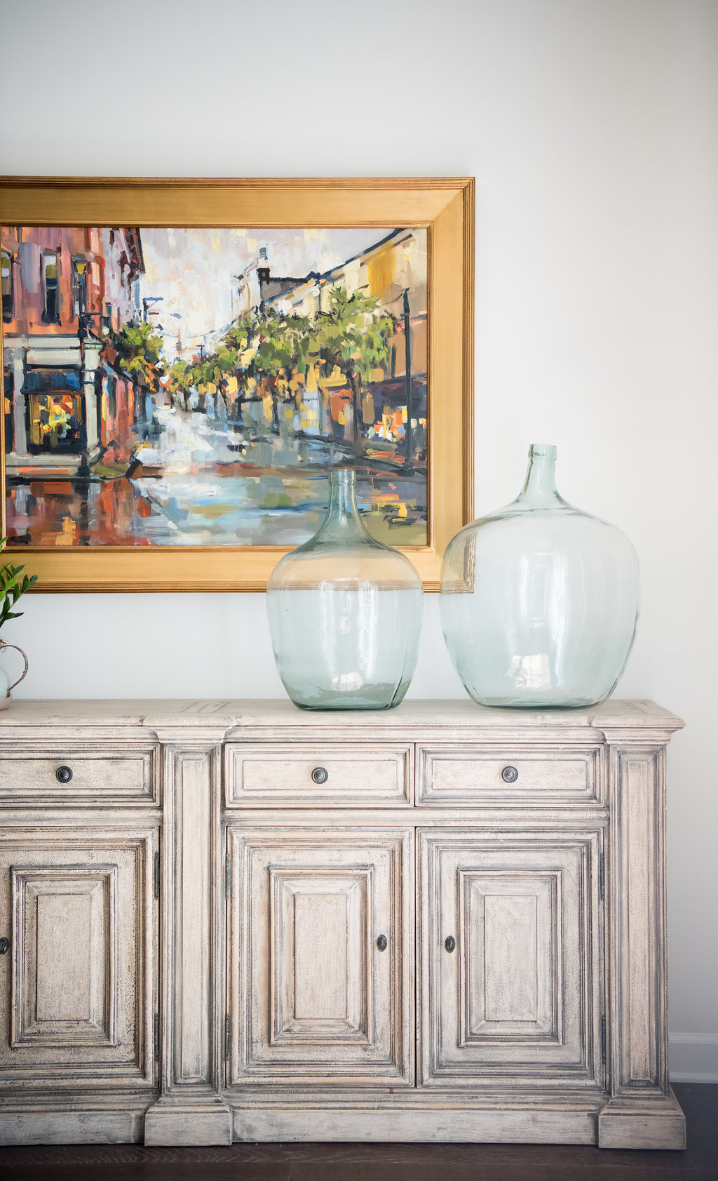
Having just gone through a fun but extensive home renovation, I am looking back and reflecting on the importance of certain design choices. I’ve already highlighted some of those decisions in writing about the significance of choosing light fixtures for your home. Today, I thought it would be important to detail how selecting paint colors plays such a pivotal role in design. While coming up with my design plan, I searched Pinterest for inspiration (of course). When it comes to paint colors, I always look to Benjamin Moore to find those classic colors that you can’t go wrong with. Today I’m sharing the Benjamin Moore paint colors that we used throughout our home.
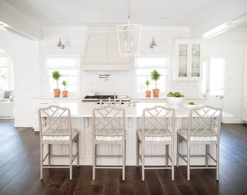
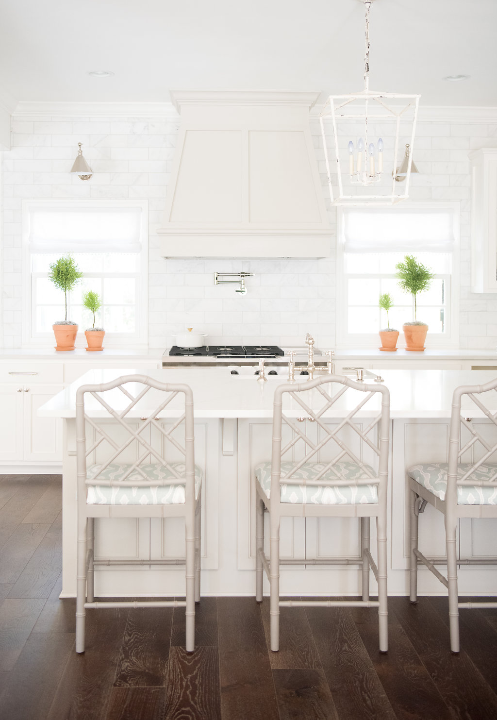
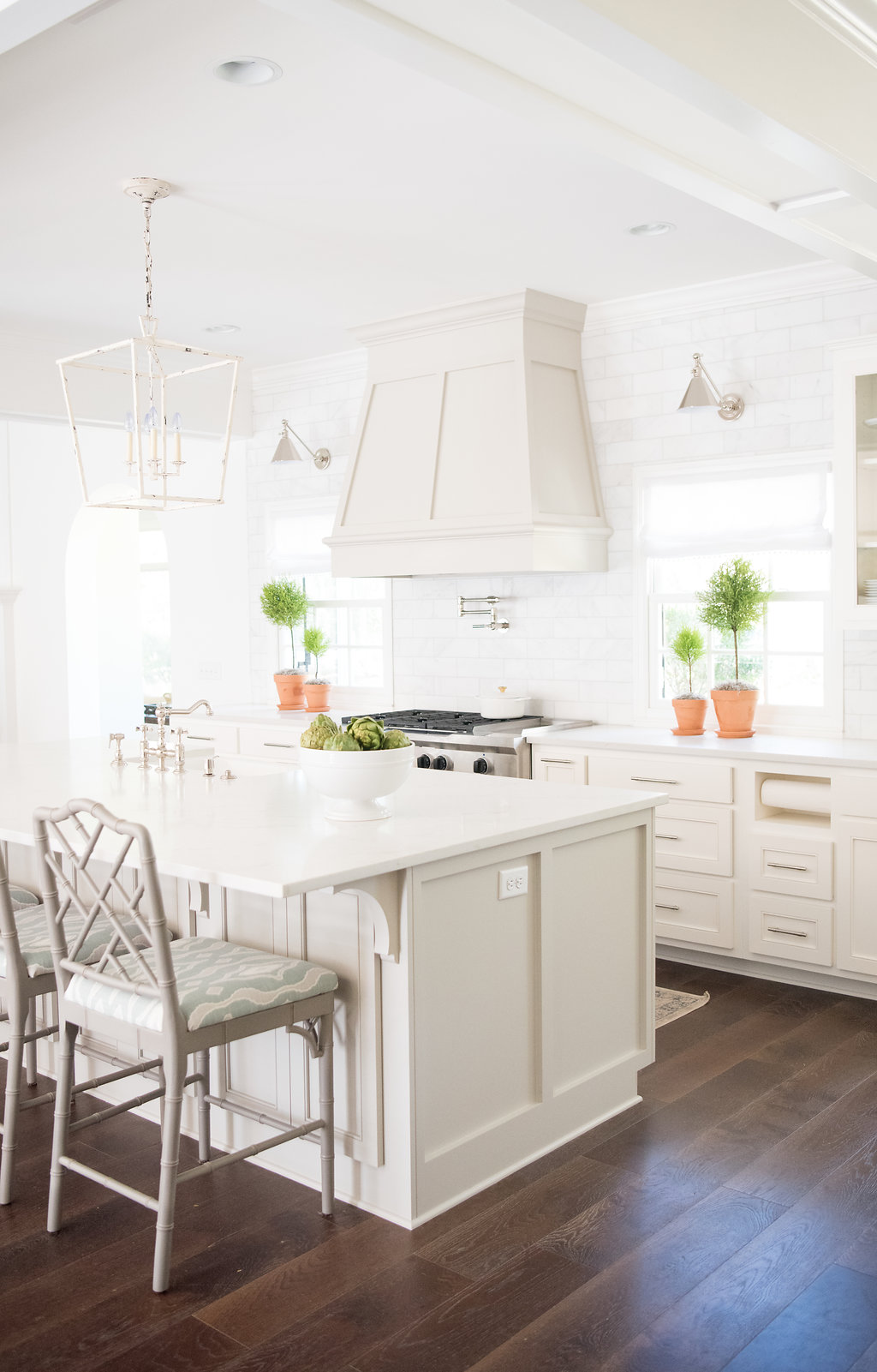
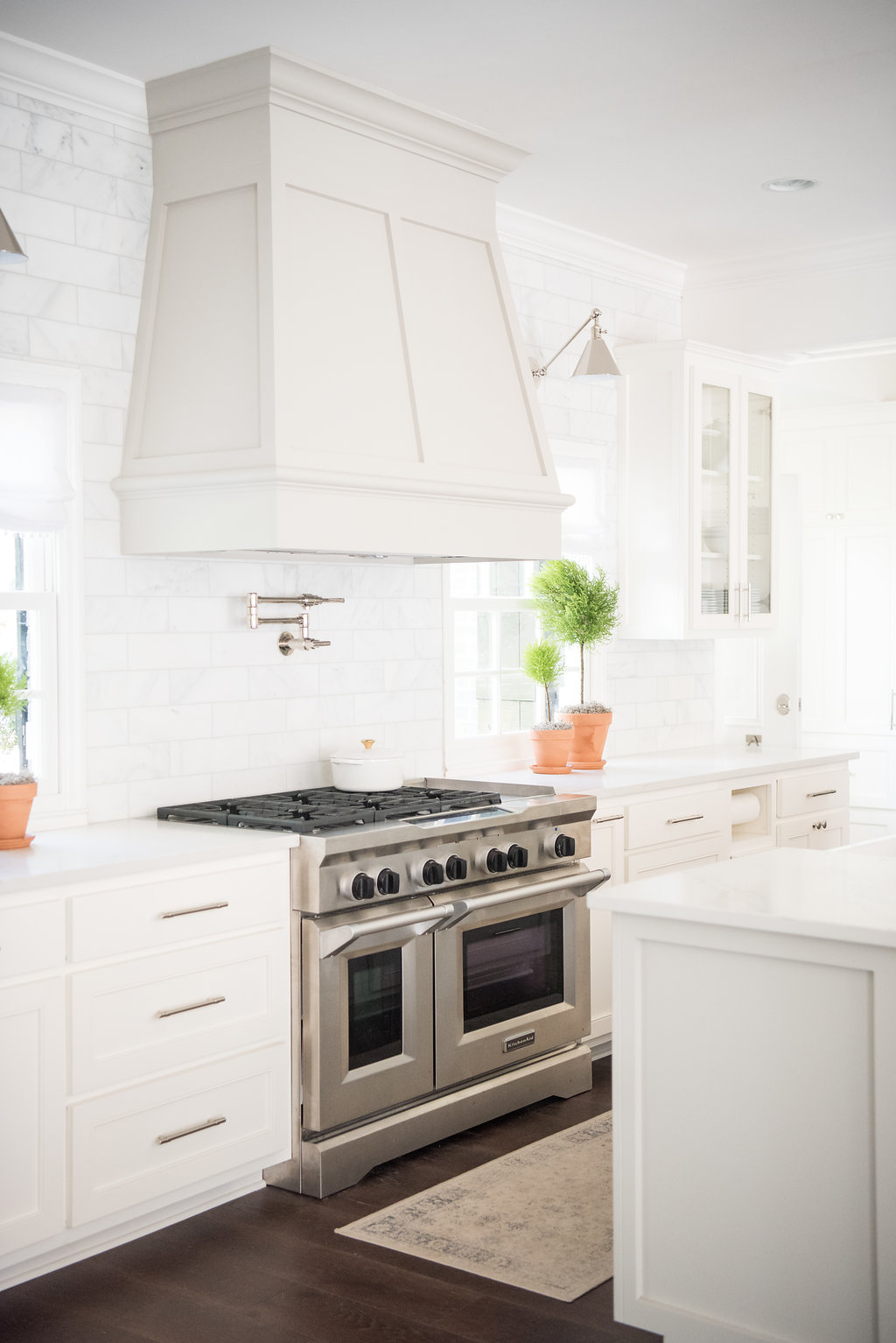
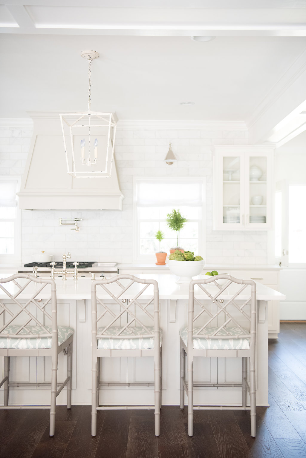
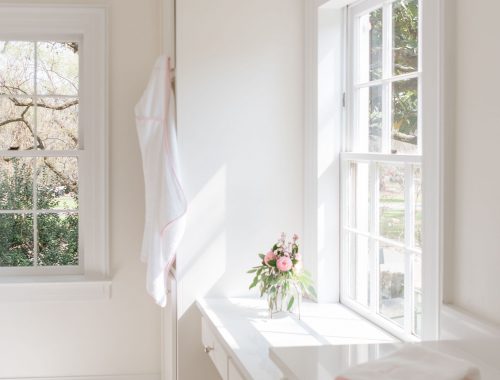
In our previous home we had used Benjamin Moore’s Winter Wheat (with White Dove for our trim) in our main living space and it added the perfect amount of beige to warm the space. I knew for our new home I wanted everything to be very bright and white without feeling like a museum. It just so happened that their 2016 color of the year was Simply White. I fell in love with this warm white and decided to use it throughout the house. As much as I love white, it’s important to choose some accent colors to add ‘life’ throughout the house. We selected varying shades of grays and blues to give the house that added detailed touch. In the kitchen, we used Revere Pewter for both the kitchen island and our custom hood. Painting those two pieces in a cool grey draws your eye in and creates a distinct focal point to the kitchen, yet blends seamlessly with all of the white.
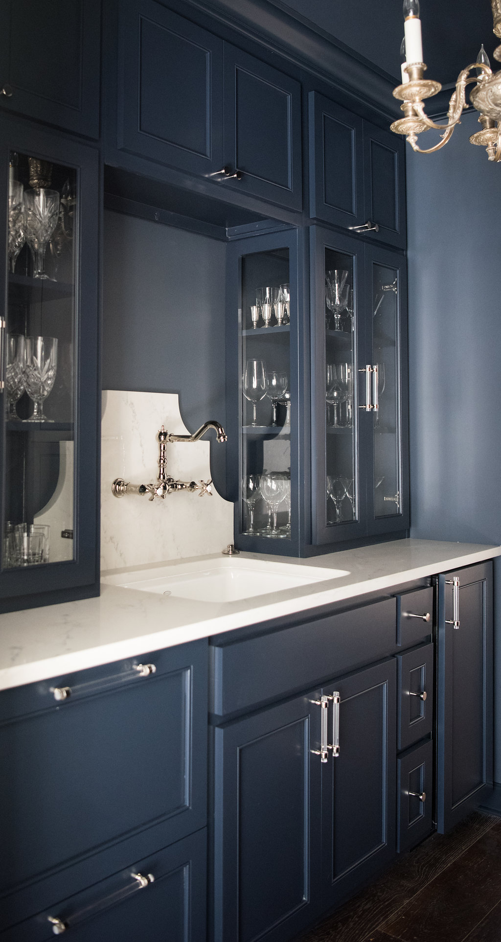
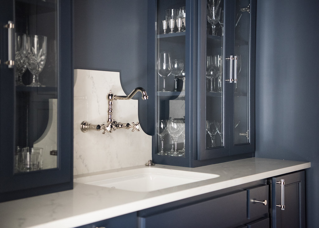
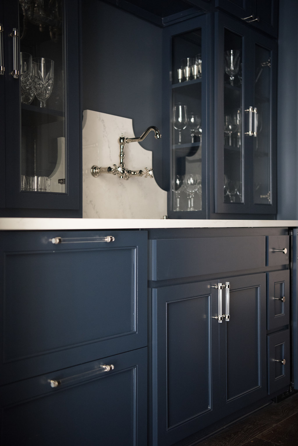
For our butler’s pantry right off the kitchen, I went bold. Hale Navy was the answer for everything in this small space. The walls, trim, ceiling and cabinets were painted varying finishes (high gloss, semi-gloss and flat) of Hale Navy. Since the space is small the bold color packs a punch! I love to see our guests’ reactions when they walk in the room. Coming from an all-white kitchen it’s a bit of a game changer.
For all of the paint in our home we opted for Benjamin Moore’s Aura . It is a combination of paint and primer together allowing for a quick and easy application. It’s long lasting, fresh looking and cleans up easily. With my beloved pups, Gracie and Riley, a paint that allows stains to easily wash off was an added selling point!
I’ll be sharing sneak peeks of the home on my Instagram feed. If you come across a wall color that you like, let me know in the comments and I’ll be happy to share the color.
This post is in partnership with Benjamin Moore.
Opinions are 100% my own.
Kelli Boyd Photography exclusively for Lavin Label
Plumbing Fixtures & Tile: Simmer and Soak
Construction & Tile Design: Leah G. Bailey
Cabinetry: Coastal Georgia Cabinetry


10 Comments
So much love your choice in using Hale Navy for the butler’s pantry. Fabulous, especially with the marble for the backsplash.
Your kitchen is beautiful. So clean and fresh looking! Love the topiaries too!
Thank you, Cheryl! I do love white 🙂
Love your kitchen!!! Where did you get those sweet topiary trees? 🙂
Hi Kirsten, I got them from Ace Garden Center and planted them. I added some preserved spanish moss to hide the soil. 🙂
[…] you know, we recently partnered with Benjamin Moore for the interior paints choices when we were renovating the house. We opted for bright and classic colors, […]
Beautiful Kitchen. Would you mind sharing the counter material? Thank you
Thanks, Alana. It’s Quartz.
Very pretty! What brand and color quartz? Please and thank you!
[…] it makes a simple design really stand out! Find all of the colors we used in the remodel here: http://www.lavinlabel.co… […]