My Main Bedroom Reveal
Layering Patterns to Create A Serene Escape
It’s finally time to reveal my main bedroom with you! It’s actually been completed for awhile but I wanted to add a few finishing touches with artwork and bedding, which as you know takes time to find just the right pieces!
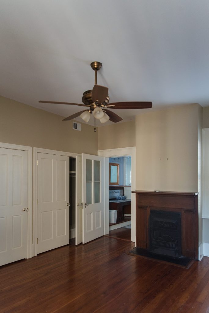
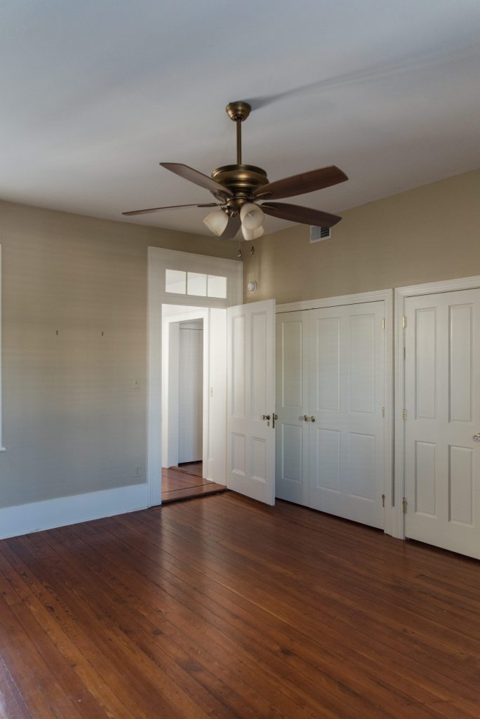
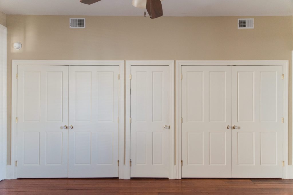
The Before.
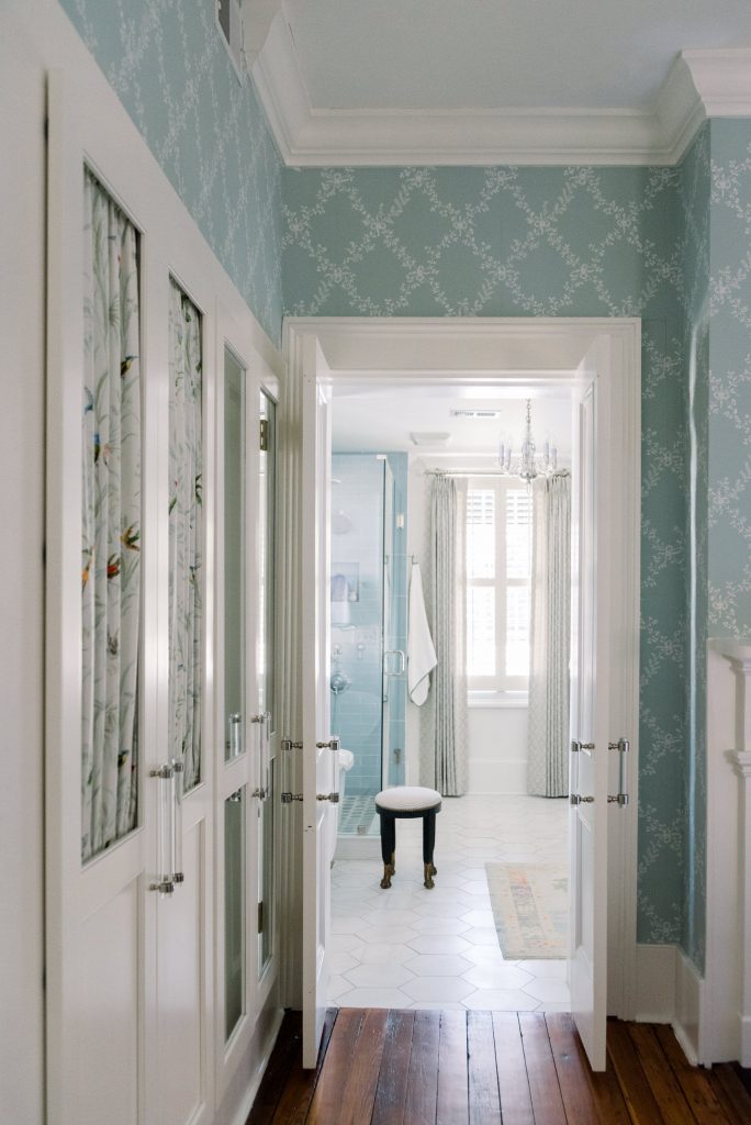
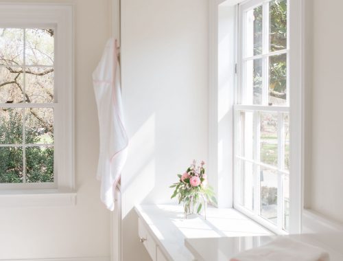
When we first purchased our home, the master bedroom was a sight for sore eyes. It was filled with doors (lots of doors) and very little closet space. It was a dark space even though it had two beautiful tall windows on both side of the room. I knew immediately that I wanted to create functional and stylish storage for clothes and shoes, as well as make the bedroom a soft, welcoming and light-filled place for us to start the day and retire at night. And in case you missed the main bathroom reveal, you can check that out on my blog as well to get an overall sense of the entire master retreat.
The After.
I’ve previously shared my main bedroom closet reveal designed by Chad Goehring of Harrison Design Associates. It gave you a peek of the wallpaper, paint and fabric choices but today I’m giving you a tour of the entire master bedroom!
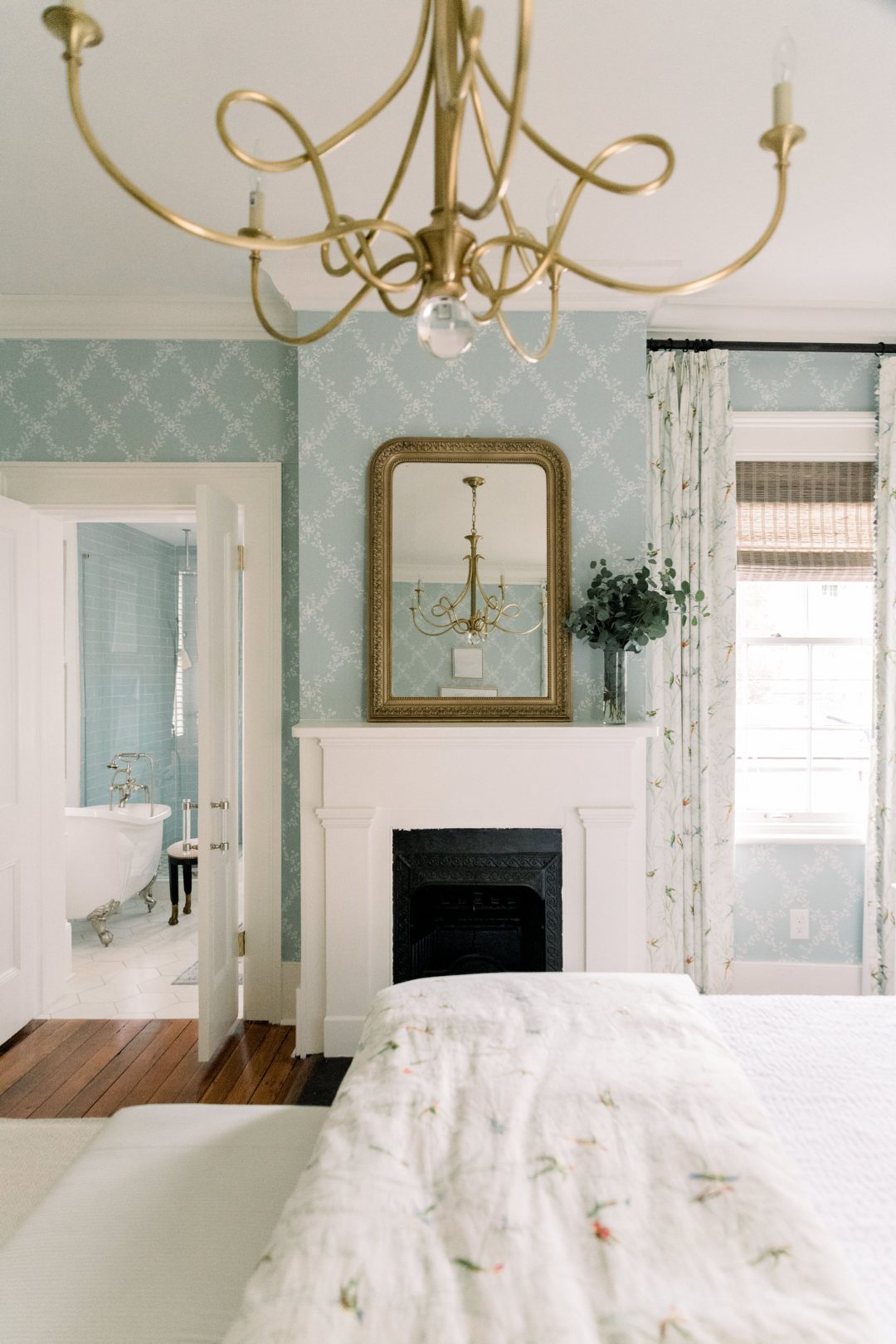
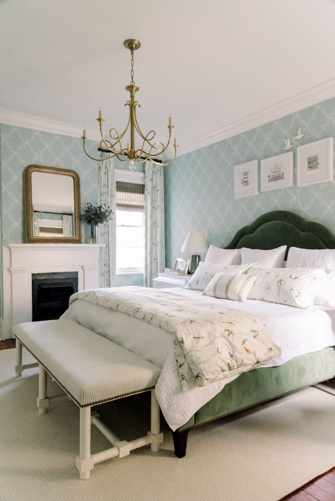
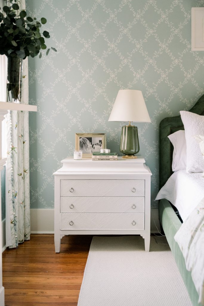
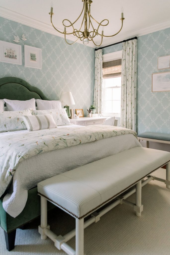
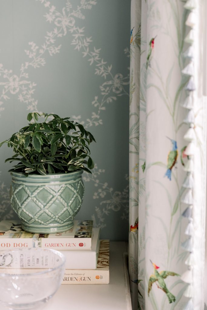
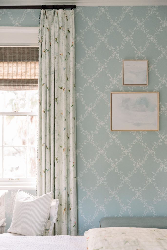
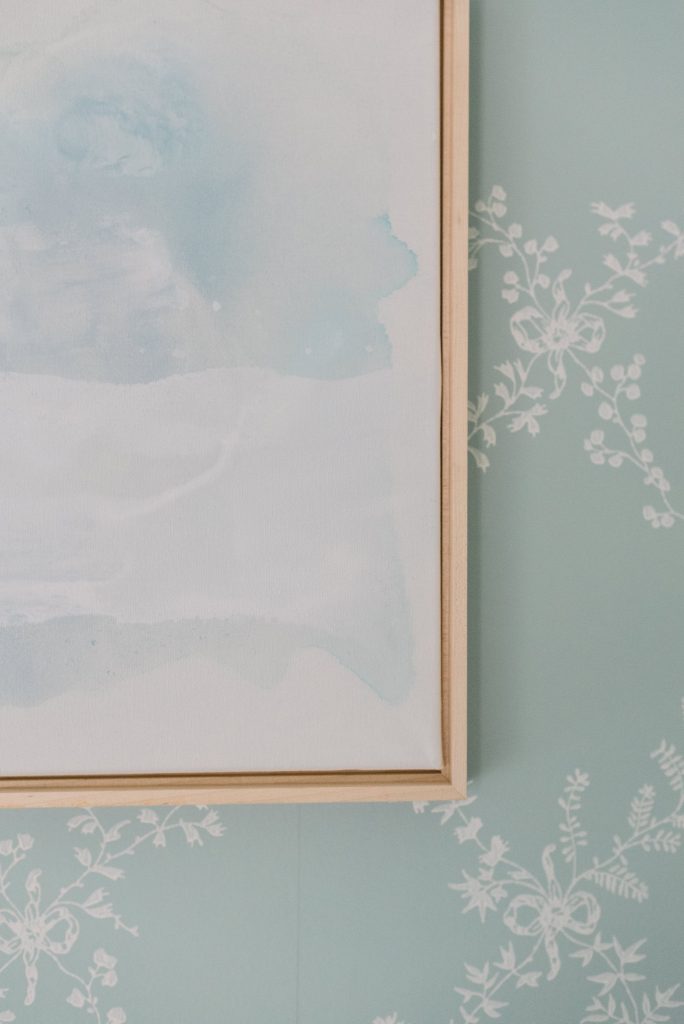
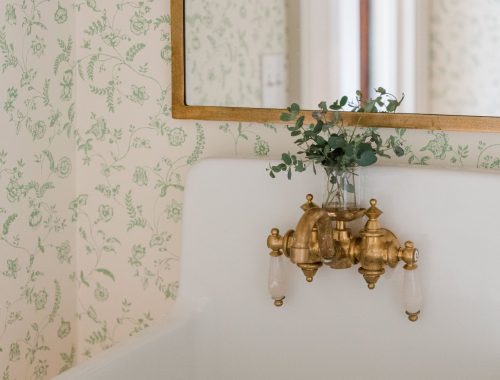
It all started with Farrow and Ball’s Toile Trellis in BP 669 wallpaper, which is a combination of Middle Ground and Pointing Number colors. I can’t tell you how much I love this wallpaper. The dainty leaf and bow motifs bring a warm nostalgia to the walls. I painted the trim Wimborne White for a crisp, clean look and I love how everything turned out.
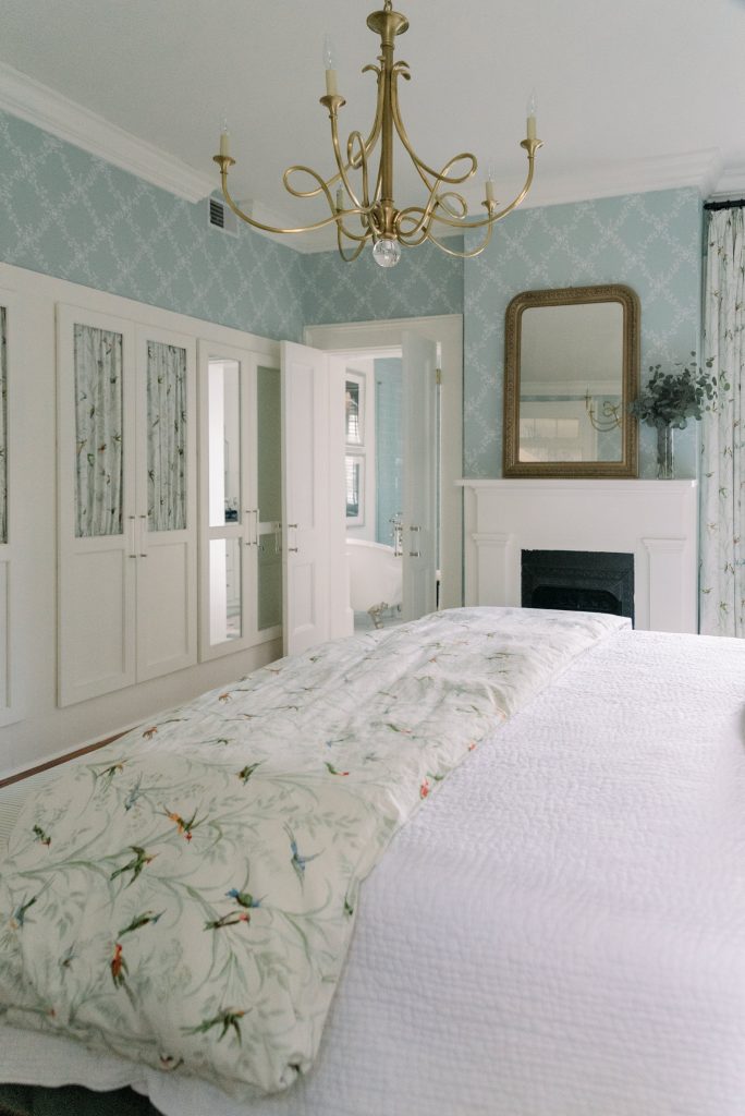
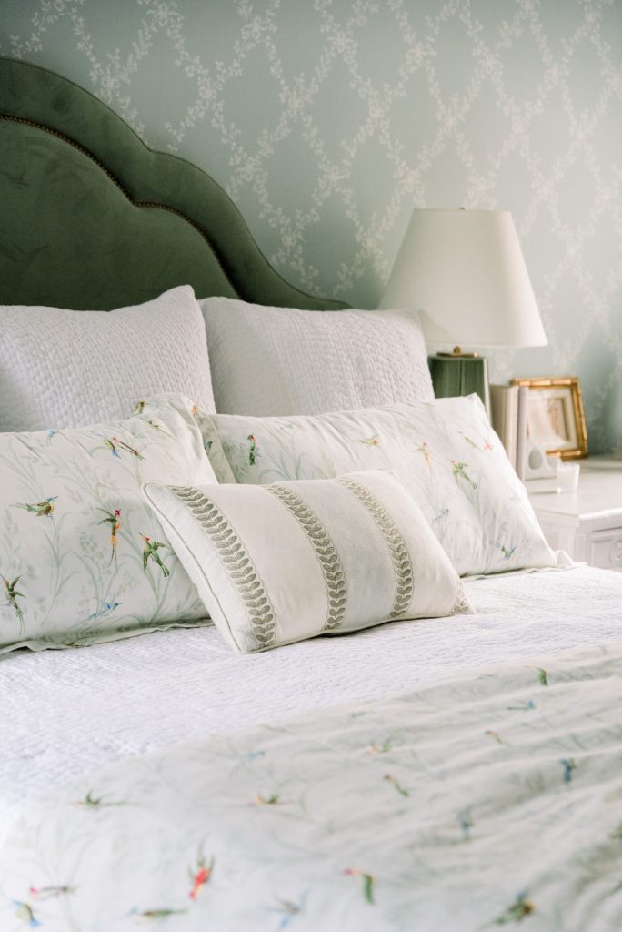
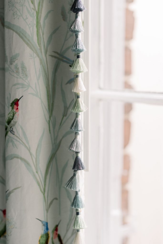
I decided to add a lot of pattern in this room since I knew that the area rug, bed and bedding would be solid colors. I really loved how Thibaut’s Augustine printed fabric in off-white looked next to the wallpaper. It was the perfect combination. I used Augustine for my window panels, duvet, pillow shams and closet doors.
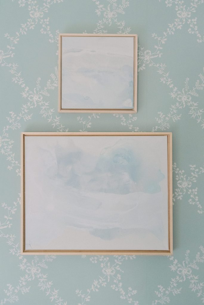
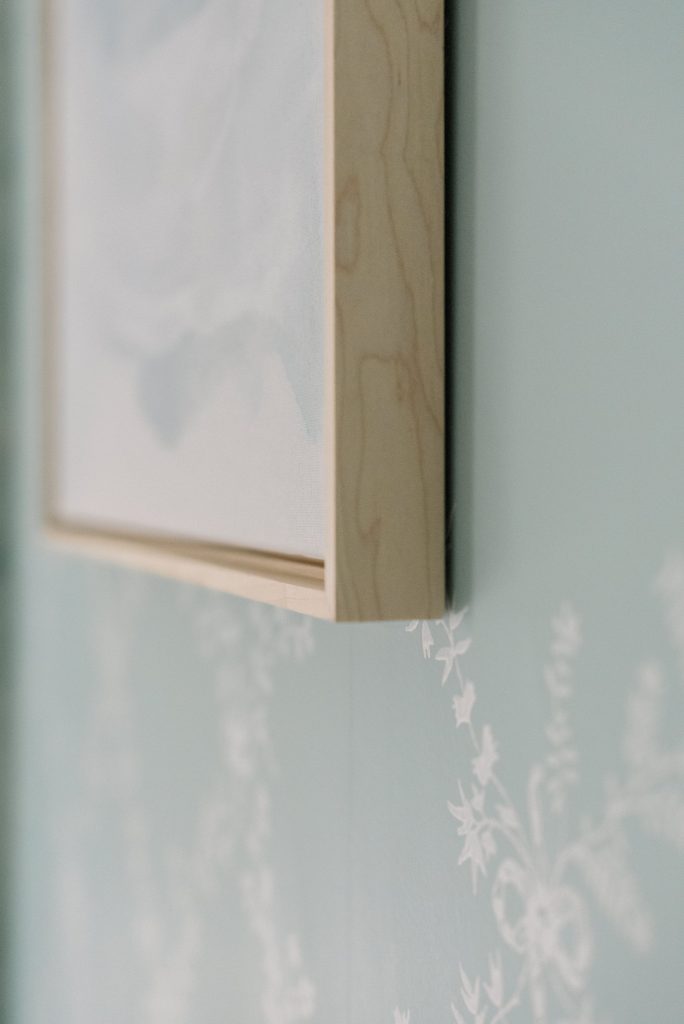
Since the wallpaper and printed fabric window panels added a lot of pattern play, it was important to find just the right artwork. I reached out to Art Consultant Liza with Liza Pruitt for help. Liza recently launched an online art collective. Her passion is to connect collectors of all levels to authentic, original artwork from around the country. I sent a few images of my space, with detailed shots of the fabrics so that she could recommend artwork that would enhance the overall look. She recommended two Helium original paintings by Jenn Thatcher, a self-taught artist based in Dallas, Texas. The tone-on-tone perfectly complements the toile trellis wallpaper and now it’s my favorite wall in my room. It’s such a treat to wake up to this soothing grouping of paintings. As we all know it can be an overwhelming process to find just the right artwork for your home. I’d definitely recommend Liza for professional advice for your upcoming project.
We had plenty of space on the back wall for a King Size Bed, a night stand and a desk. I love mixing different types of furniture, especially bedside tables. I opted for the Marilyn Chest from Gabby Home. I already had Gabby Home furniture in my guest bedroom so I am well aware of their high-quality and gold standards for every piece they create.
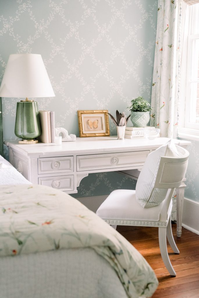
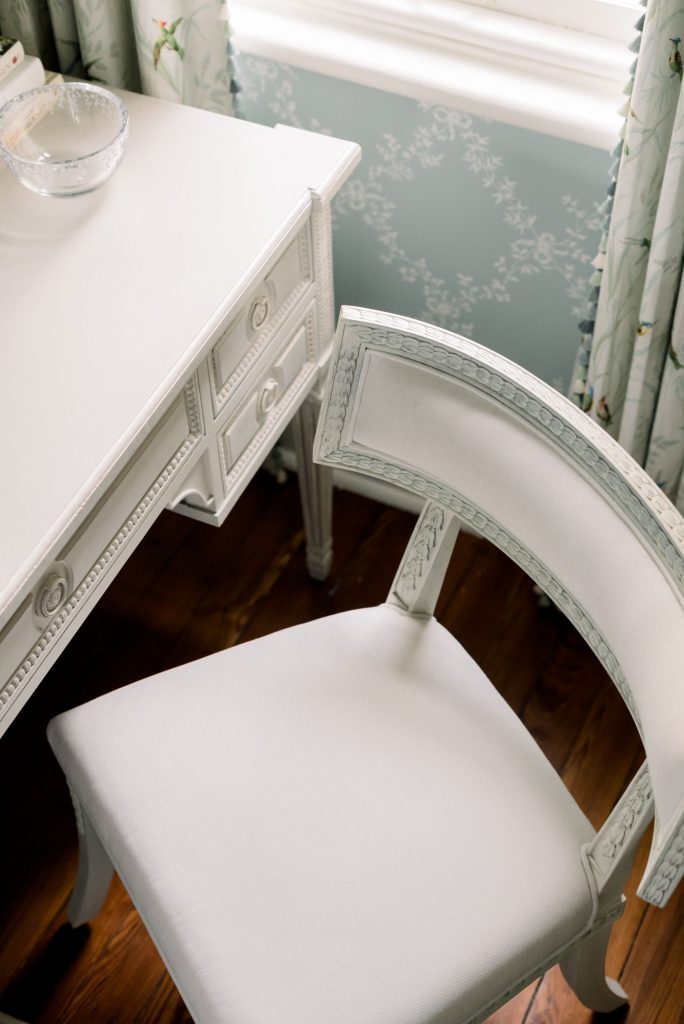
I knew that I wanted a desk in our bedroom so that I could have a dedicated space to work on Lavin Label. I immediately fell in love with the Aria Desk and Aria Side Chair from Ave Home. When I received these pieces I was blown away by the amount of detail and craftsmanship. These are gorgeous! I wish that you could see them in person to truly appreciate the design. I’ll definitely be ordering from Ave Home in the future, maybe something for the nursery?!
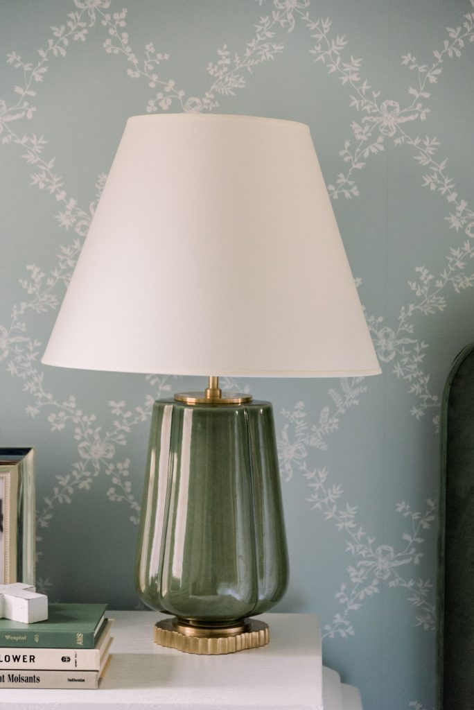
Of course, I added finishing touches with a Circa Lighting chandelier and table lamps, as well as luxury bedding from Garnet Hill. I found an antique mirror from the 1800s at Scott’s Antique Market in Atlanta, and opted to bring in brass lighting fixtures to match. The showstopper is the Double Twist Large Chandelier by Eric Cohler that hangs above the bed. It’s the perfect height, and the glass ball at the bottom adds a delicate touch to the overall design. On each bedside table, I opted for the Penelope Table Lamp designed by Alexa Hampton. The green porcelain matches the dark green headboard and adds contrast to the blue green wall color.
Lastly, the bed is from Mr. and Mrs. Howard, upholstered in Quaker Green with a brass nailhead detail. Their Square Peg Round Hole Bench in Ridgeville Sage (green and white stripe) anchors the bed while providing space to place clothes and extra pillows while we sleep. Above the bed, I framed my original paintings from my Art of the Entry Collection in partnership Dixie Design and Shanna Masters. You can purchase these same prints online at Dixie Design. They’d also be perfect for a bathroom, nursery or sunroom!
Thanks so much for stopping by! Would love to hear your feedback!


No Comments